
Strava, redesigned
A self-initiated audit of the ride-tracking screens, finding where the app adds friction mid-ride, and a redesign that keeps the route and the numbers in one glance.
At a glance
- Goal
- Make mid-ride screens readable at a glance
- Built with
- Miro, Figma, Illustrator, InDesign
- Result
- 4 fixes: route clarity, bigger buttons, auto-rotate, one view
The problem
Strava’s experience for cyclists created usability issues that could potentially put the cyclist in danger.
User feedback indicated that cyclists found certain aspects of Strava’s experience frustrating and created anxiety. Buttons (placement, padding, and size), flow, and color scheme are the top areas of concern for cyclists.
Goals
- Reduce the amount of app interactions during a bike ride
- Condense important information into one view during a bike ride
- Create a clearer and vibrant bike ride experience by redesigning existing components and introducing new components and features
Scope
I only focused on redesigning Strava’s cycling in-ride and post ride experience on the Android app.
Tools
Figma, Miro, Strava brand guidelines, Adobe Illustrator, and Adobe InDesign.
Background
What is Strava?
Strava is a social network for athletes and weekend warriors to track, measure, analyze, and share their physical exercise activities. Their platform has over 30 types of activities and its social network features has created the largest sports community in the world. It is the leading service to record and upload cycling rides through its mobile app or via a third-party GPS bike computer. Each ride records time, speed, distance, and elevation. Additional features, like user-generated "segments", brings a competitive spirit to the social networking side of Strava.
How and why I got into cycling
I started cycling in the summer of 2018 after a couple of friends talked about their rides. For over 20 years I played soccer to keep the extra pounds off, but it was taking a toll on my body. My knees and lower back were sore and strained from playing on artificial turf. I was looking for a new, fun, and low impact activity. And if I could do it with my friends, even better. I didn't know much about cycling (I did know how to ride a bike), so through the advice of my close friends, I purchased my first road bike, acquired the right gear, and downloaded Strava.

The process
Experience map
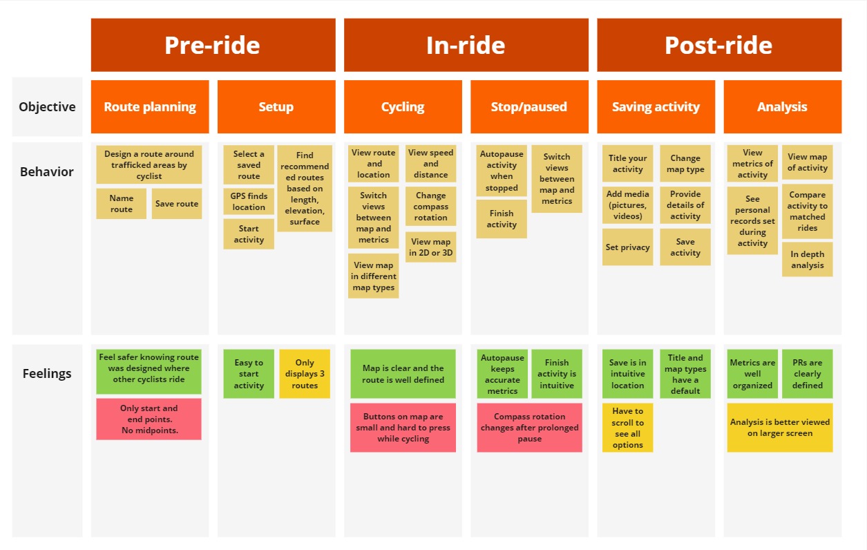
To simulate a real-world, design thinking activity, I created an experience map in Miro. This map is similar to an affinity diagram, but highlights the order of actions and pain points experienced along the way.
First, I added steps for each objective that are common during a cycling ride with Strava. Then, I added feelings that were gathered from user interviews for those objectives. The feelings are grouped into themes. Green boxes represent a positive experience, yellow boxes represent a neutral experience, and red boxes represent a negative experience.
Pain point: Route visibility
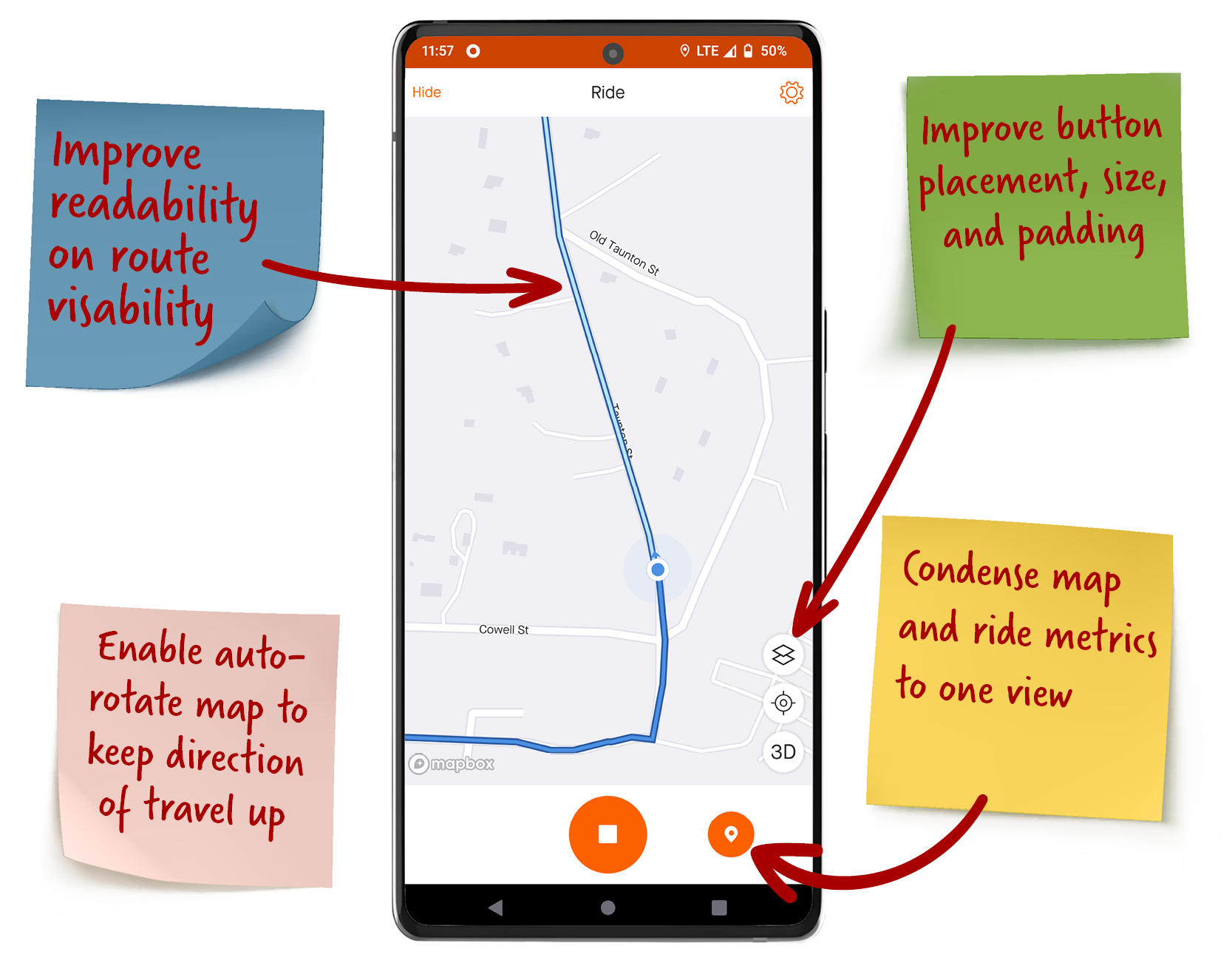
Improve readability on route visibility. Strava uses two shades of blue to visualize the route and the cyclist’s progress. A more contrasting color palette is needed to improve readability on route visibility and cyclist’s safety.
Pain point: Buttons
Improve button placement, size, and padding. The cluster of icons on the map are small and too close together, especially during a ride. To accommodate different use cases, the buttons need to be bigger with more padding and placed in more accessible areas.
Pain point: Auto-rotate
Enable auto-rotate map to keep direction of travel up. In map view, the map does not rotate in the cyclist’s direction of travel. Enable auto-rotate to prevent cyclists from manually rotating the map to keep their direction of travel up while cycling.
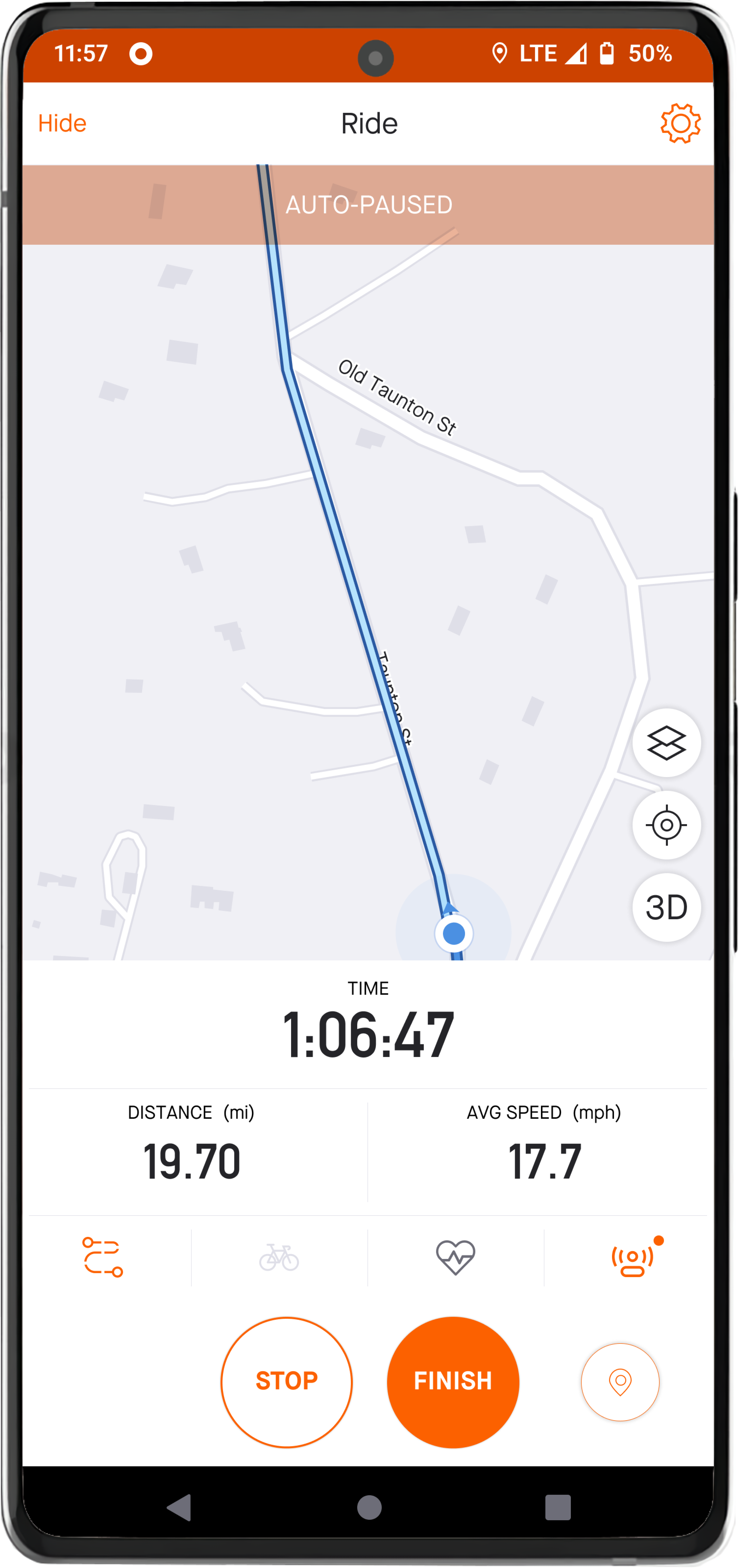
Update: Strava solved this in summer of 2022. However, when the ride is auto-paused, the compass will default back to "north up". The cyclist has to tap the compass icon to change back to "auto-rotate".
Pain point: Ride metrics
Condense map and ride metrics to one view. To see speed, distance traveled, or time elapsed, a cyclist must tap the small icon in the bottom right. Give the cyclist an option to view metrics and map on one view.
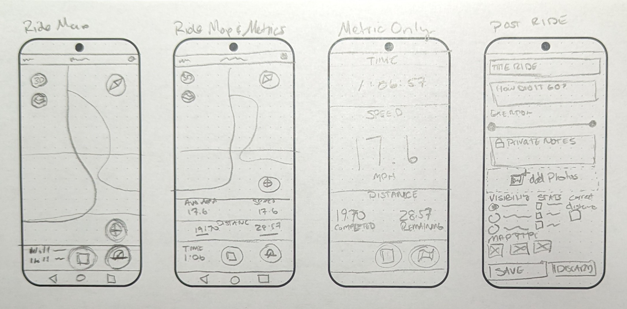
Wireframes
The solution
Solution: Route visibility
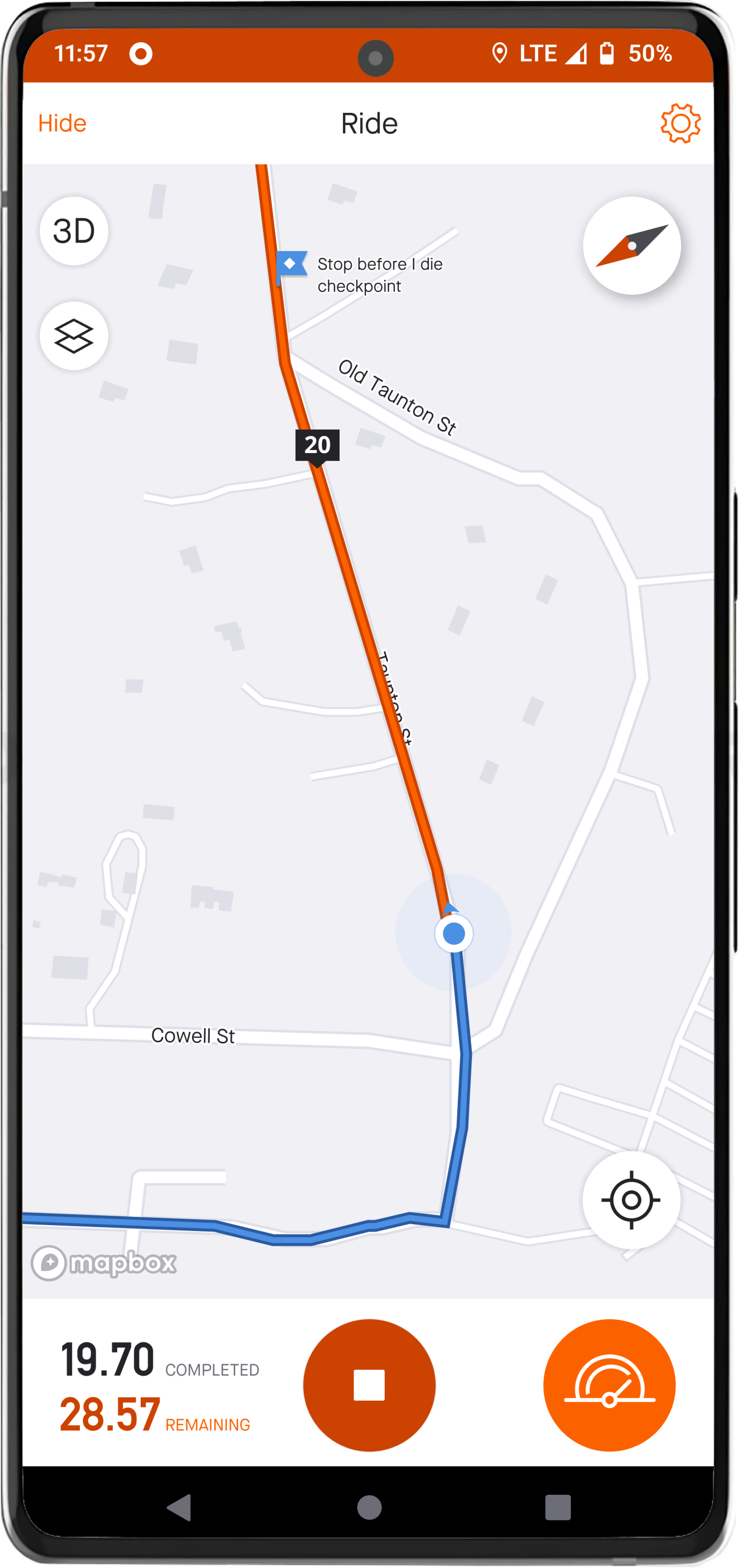
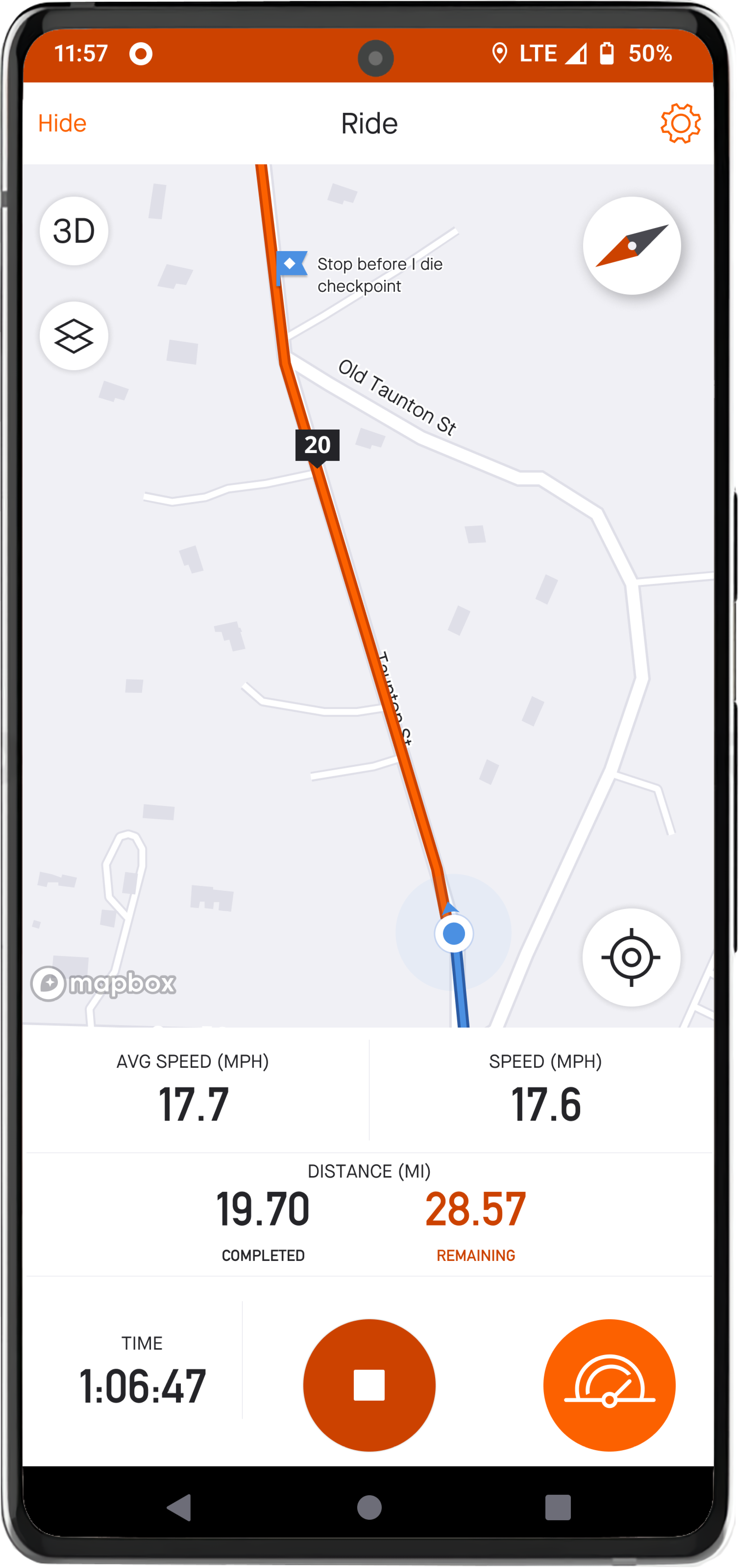
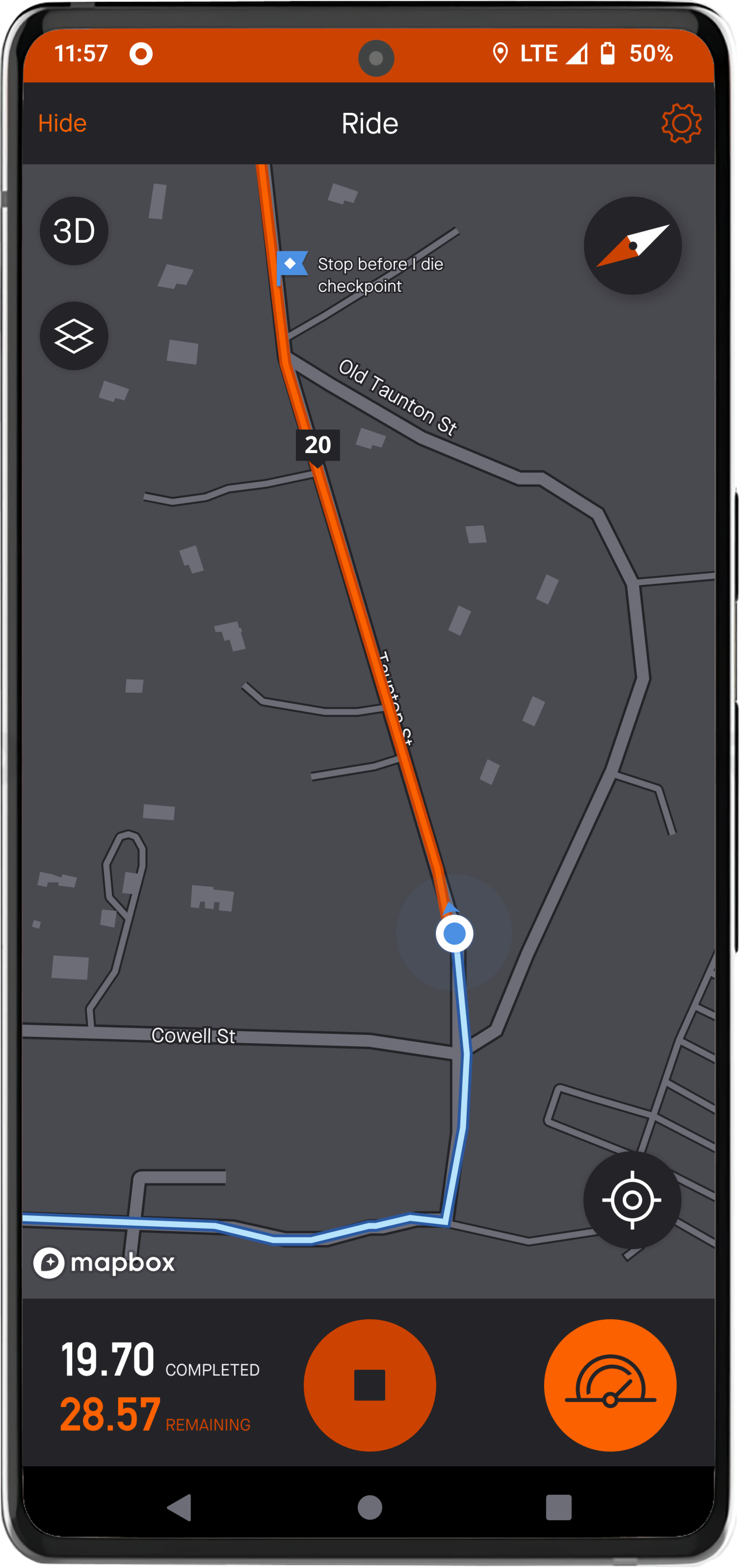
I changed the color that represents the remaining part of the route to Strava’s orange and stroked it with a darker orange (Rust in Strava’s color palette).
Solution: Buttons
The primary buttons, “Locate” and “Compass”, were increased by 42%. They were increased to make them easier for the cyclist to tap while traveling at speed. The terrain and 2D/3D buttons remain the same size because these buttons are secondary to the other buttons on the map. The button to switch screens was increased by 70% and matches the size of the “Stop” button in the center.
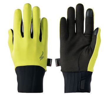
Padding for the buttons on the map was increased, and the buttons were moved further away from the edge to address limitations caused by cyclists’ gloves, phone mounts, and reduced touch precision.

Solution: Ride metrics
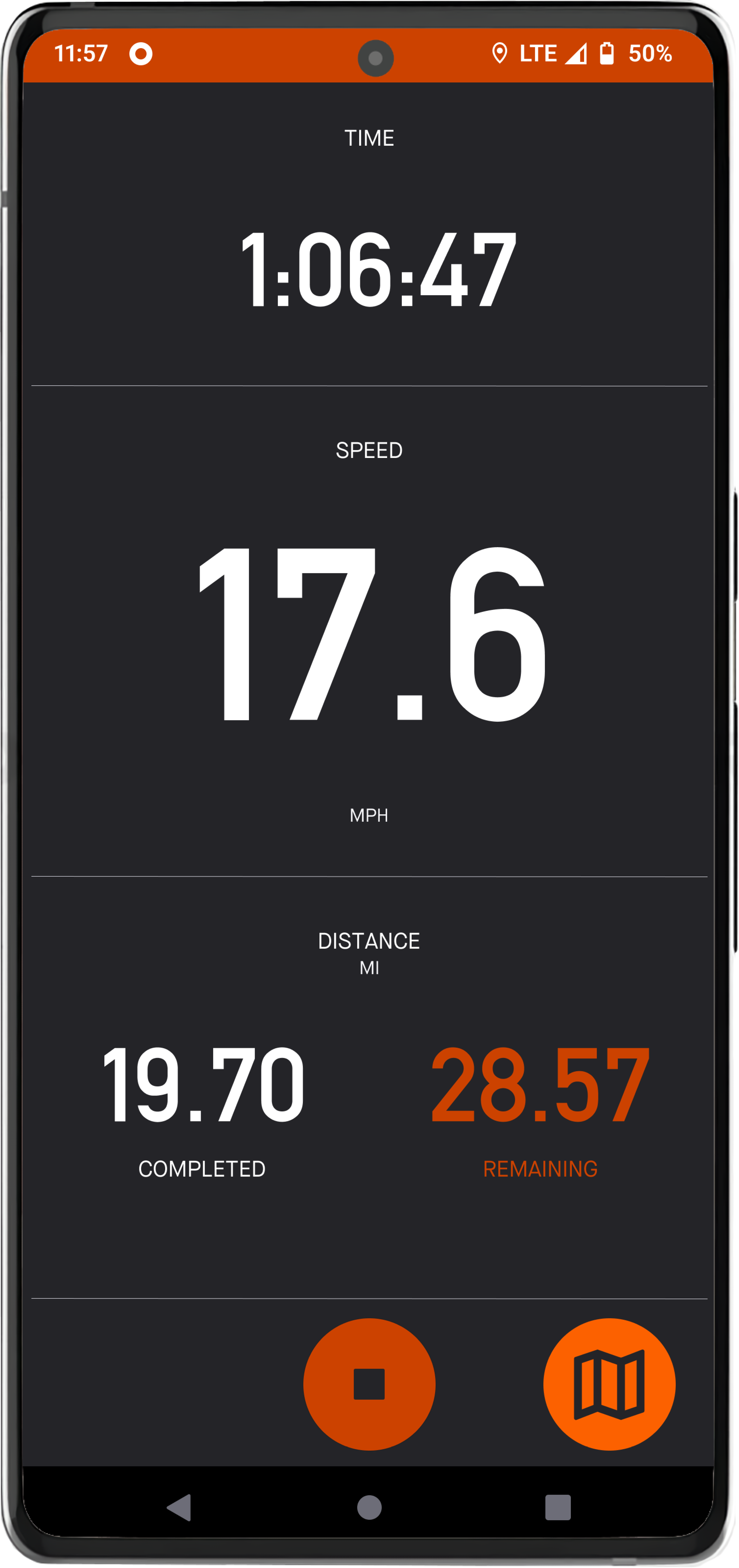
In map view, I utilized the empty space in the lower left for displaying ride metrics. I give the cyclist three static options to choose from (remaining distance, total distance, and a progress visual). Tapping this area will allow the cyclist to switch options. Additionally, in Settings, an option to auto-rotate the three options will be available.
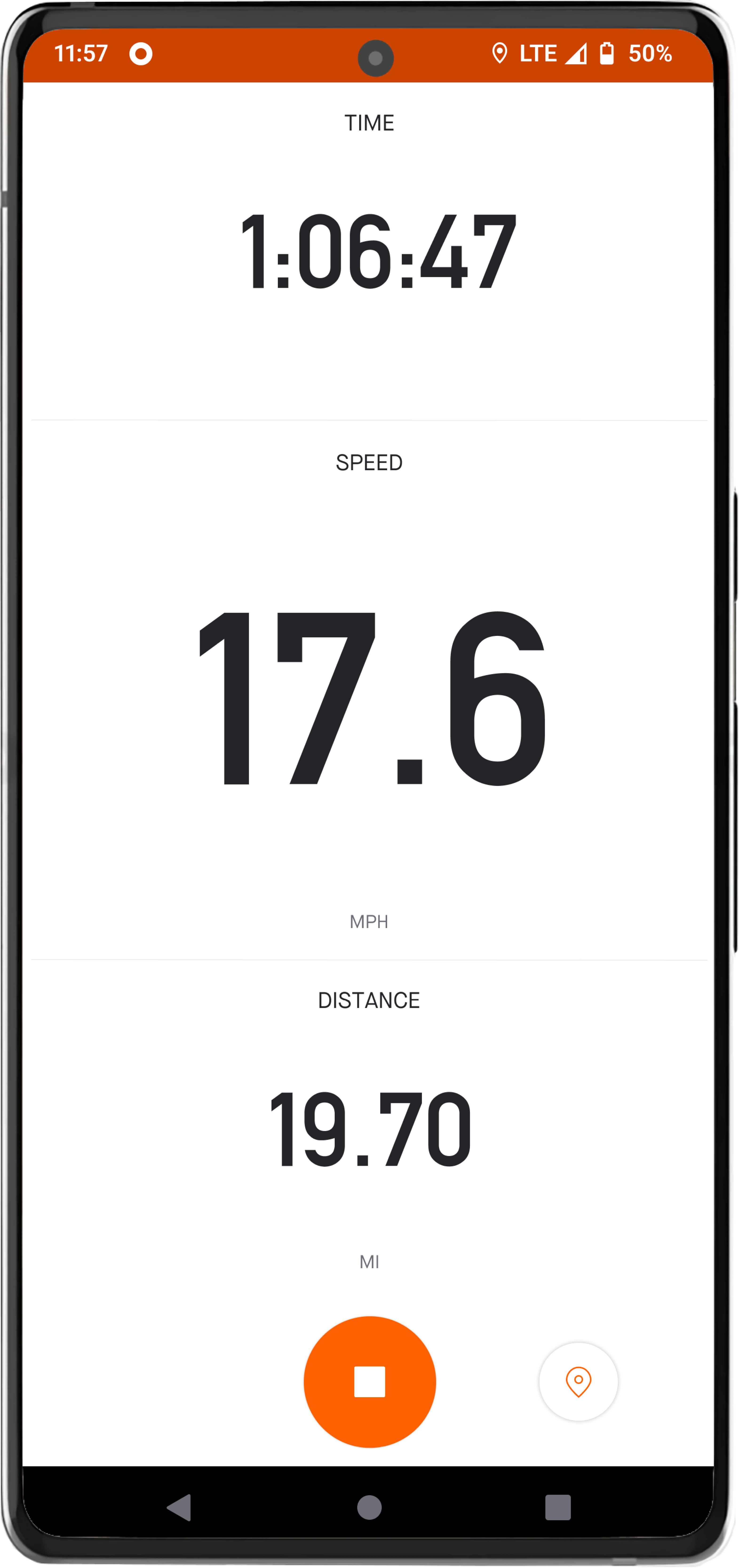
Redesign: Metrics view
I redesigned the metrics view to incorporate the new metrics (remaining distance and progress visual).
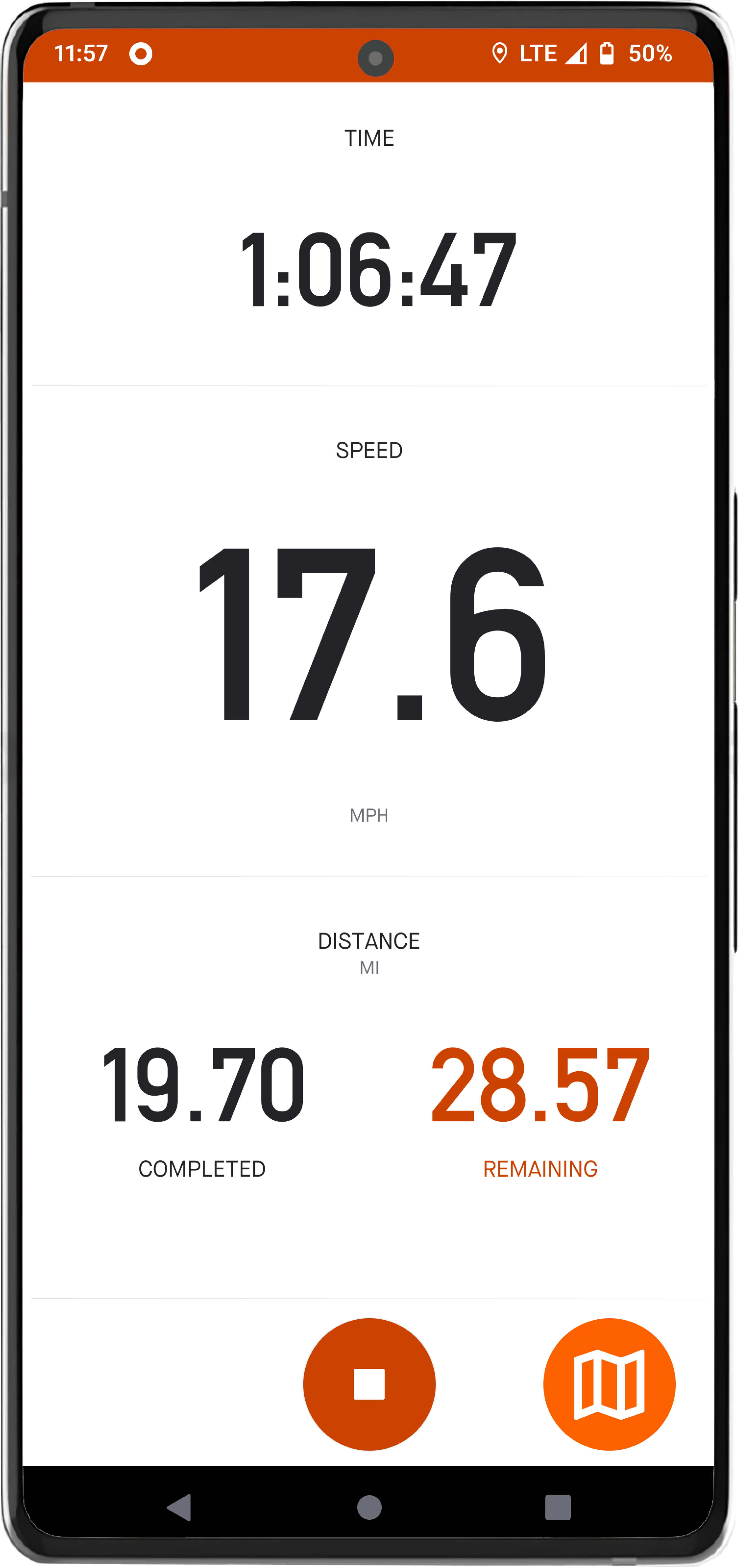
New view: Map and metrics view
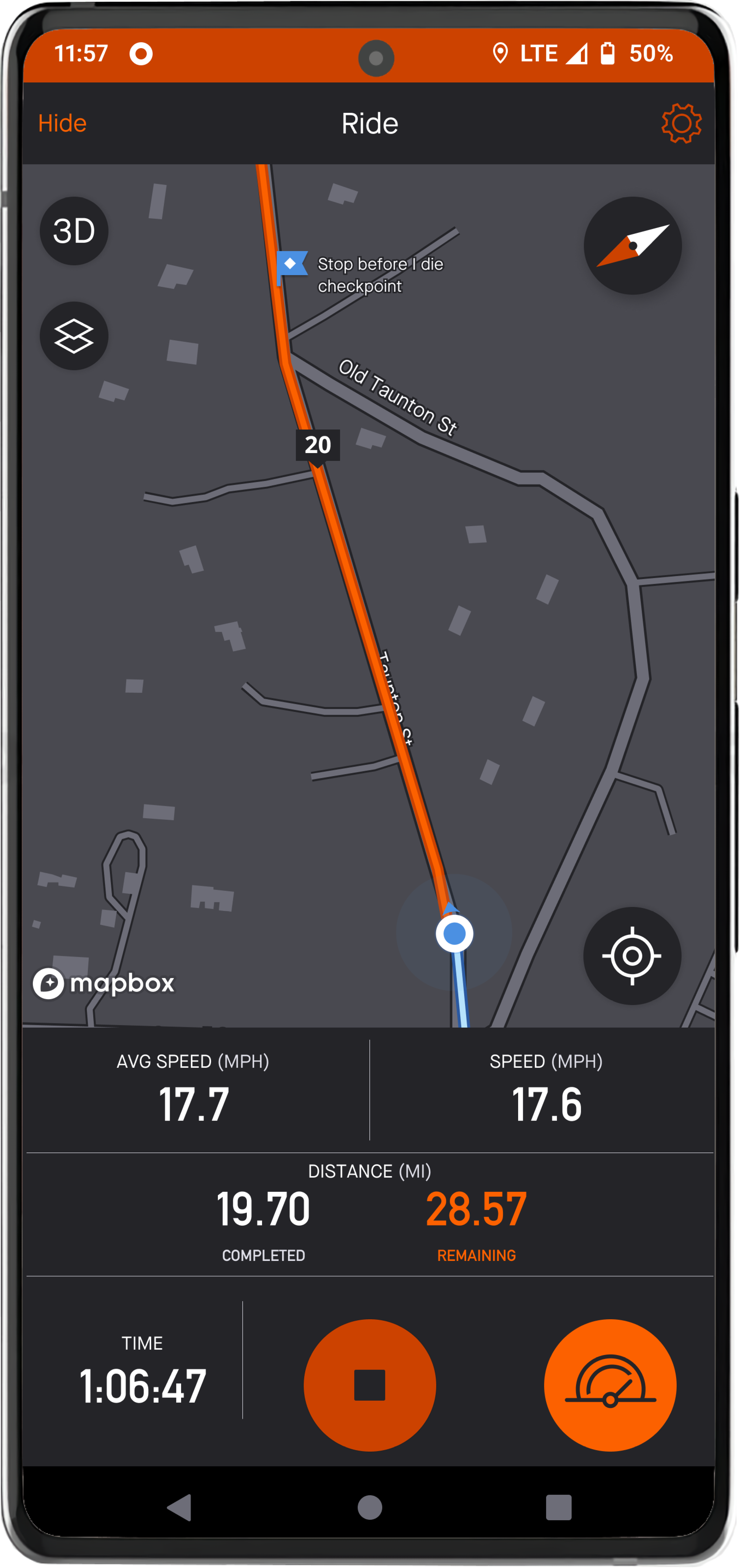
Taking inspiration from the current extended pause view, I designed a view that combines the map and metric view. It provides the cyclist their speed (current speed and average speed), distance, and time elapsed.
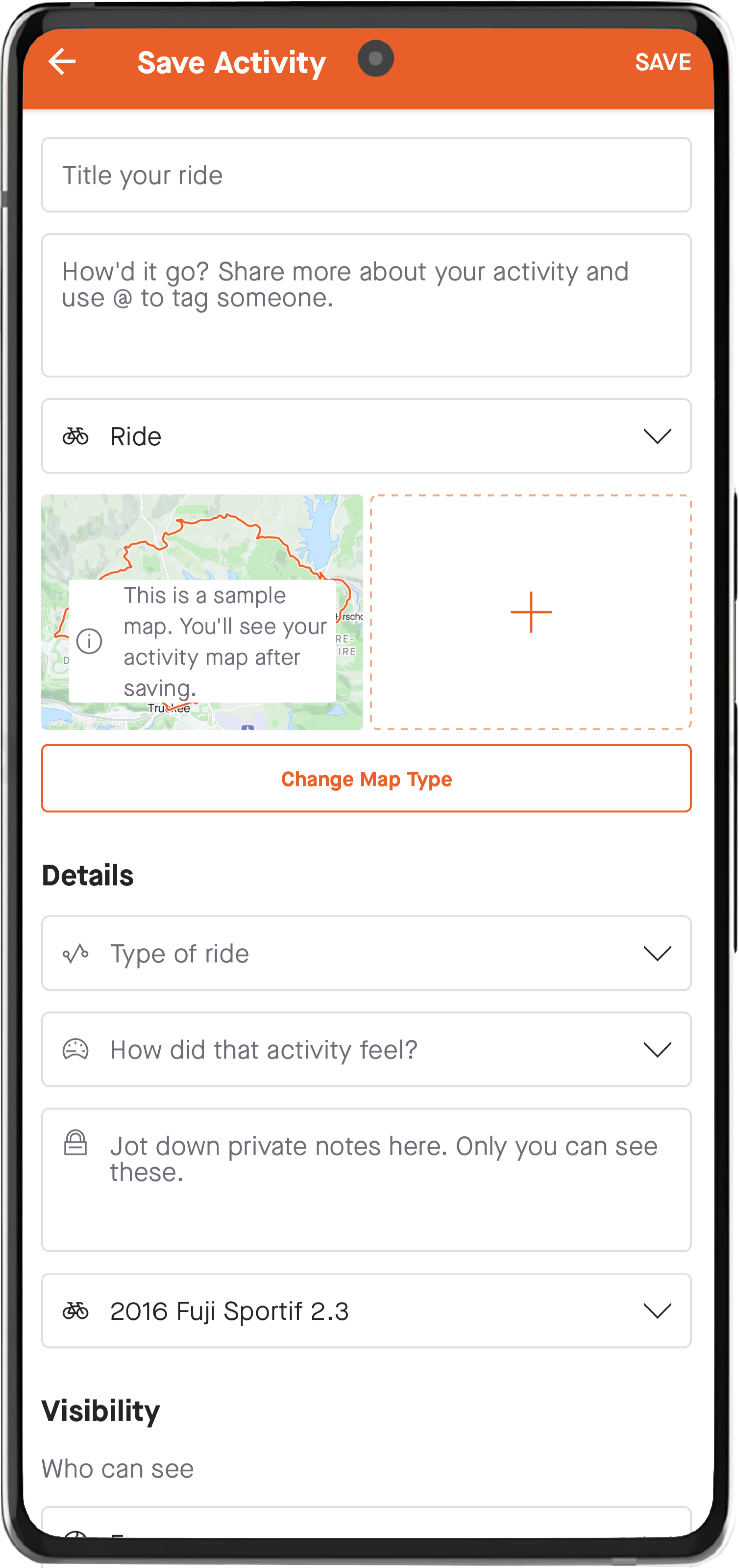
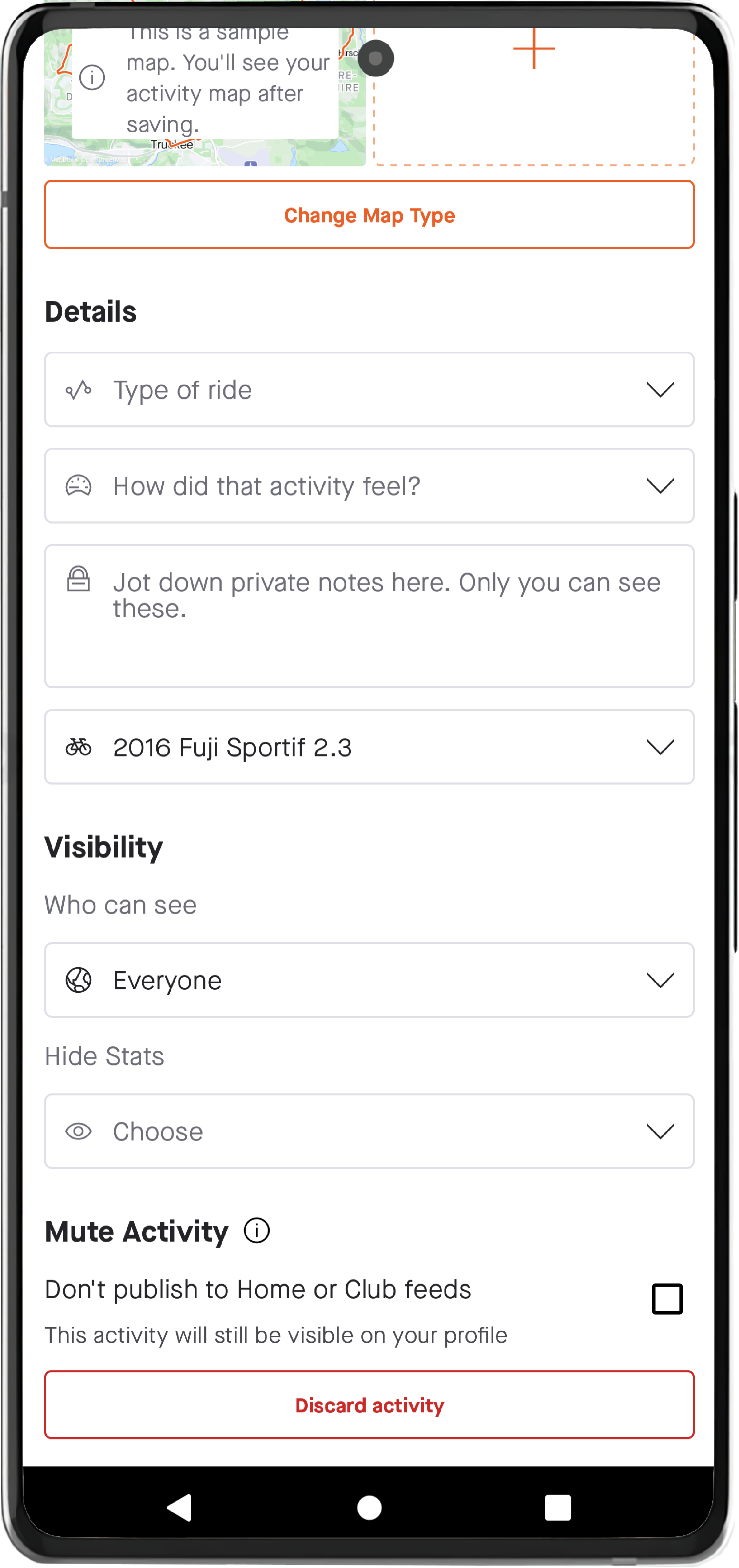
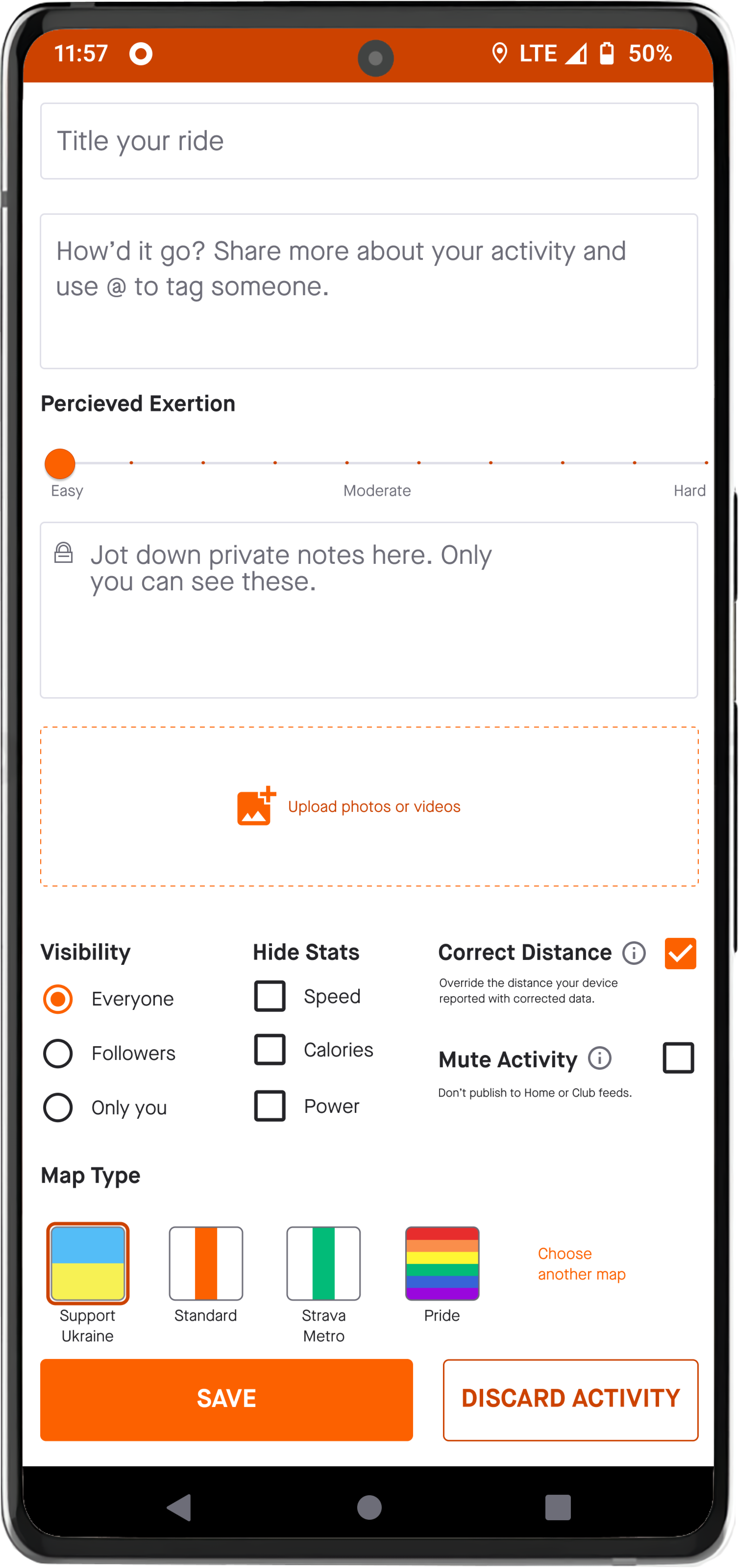
Redesign: Post activity view
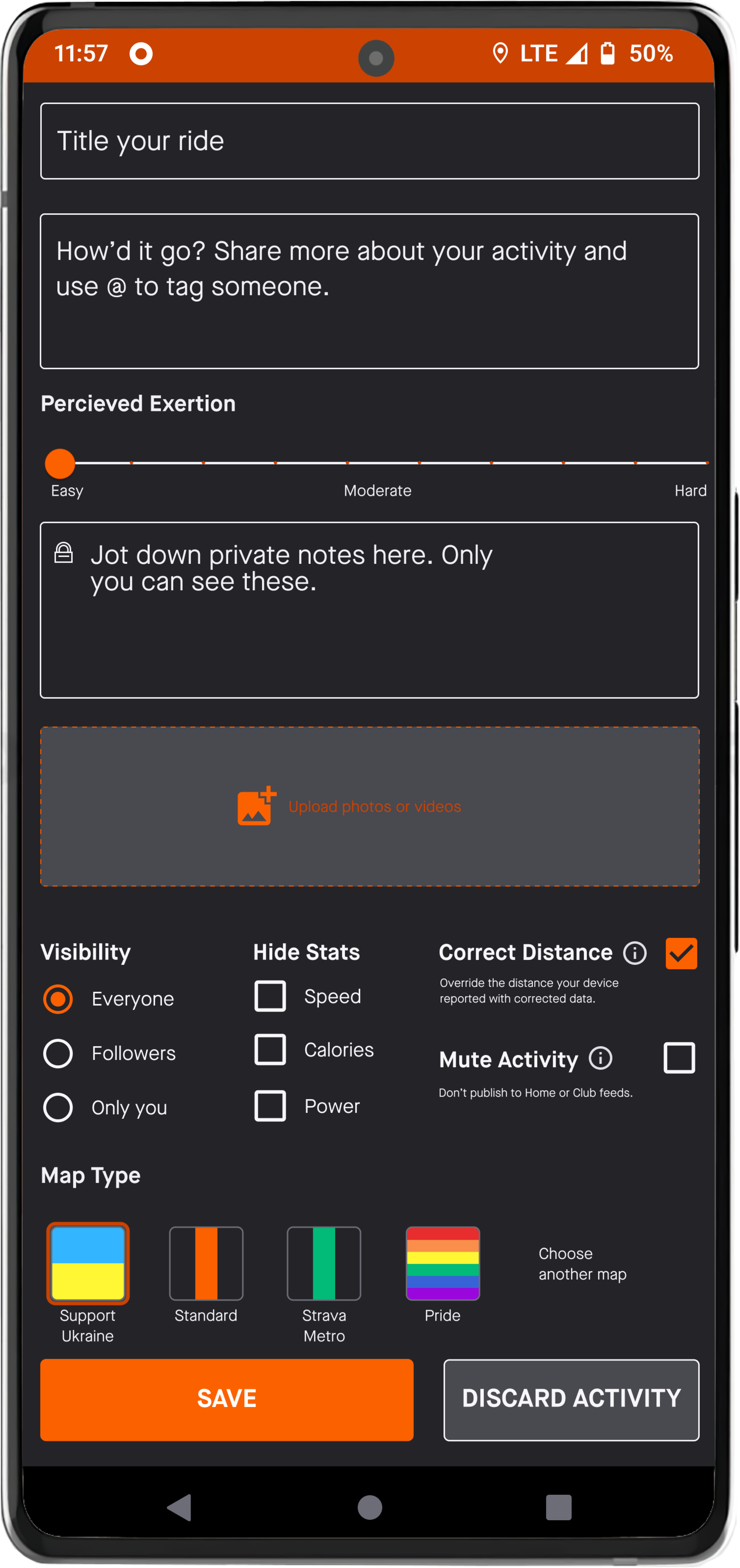
I redesigned the post activity view to condense it to be completely visible without scrolling.
Dark mode prototypes
Each of the redesigned screens also has a dark mode version.
Conclusion
In conclusion, my UX case study for Strava’s cycling activity redesign aimed to improve the user experience and (more importantly) provide a safer experience for cyclists by addressing difficulties with route and ride metrics visibility as well as button size and placement. Through user research and iterative design, I implemented improved route visibility by differentiating route completion and route remaining with contrasting colors for activities where a predefined route has been selected. Additionally, I created new views that incorporate ride metrics with the map view that will also improve safety. Part of the map view redesigns addressed the pain point of button size and placement. I prioritized the locating and compass buttons by enlarging them (which also addressed safety concerns) and adjusted the placement of the buttons on the map further from the edge of the screen. This placement adjustment covers special use cases for cyclists.
Strava is unique in the sense that using the app can cause the user to put themselves in a dangerous situation. This project highlighted the importance of safety and ease-of-use when designing for cyclists. Regular outreach to users would uncover the pain points that I have discovered.