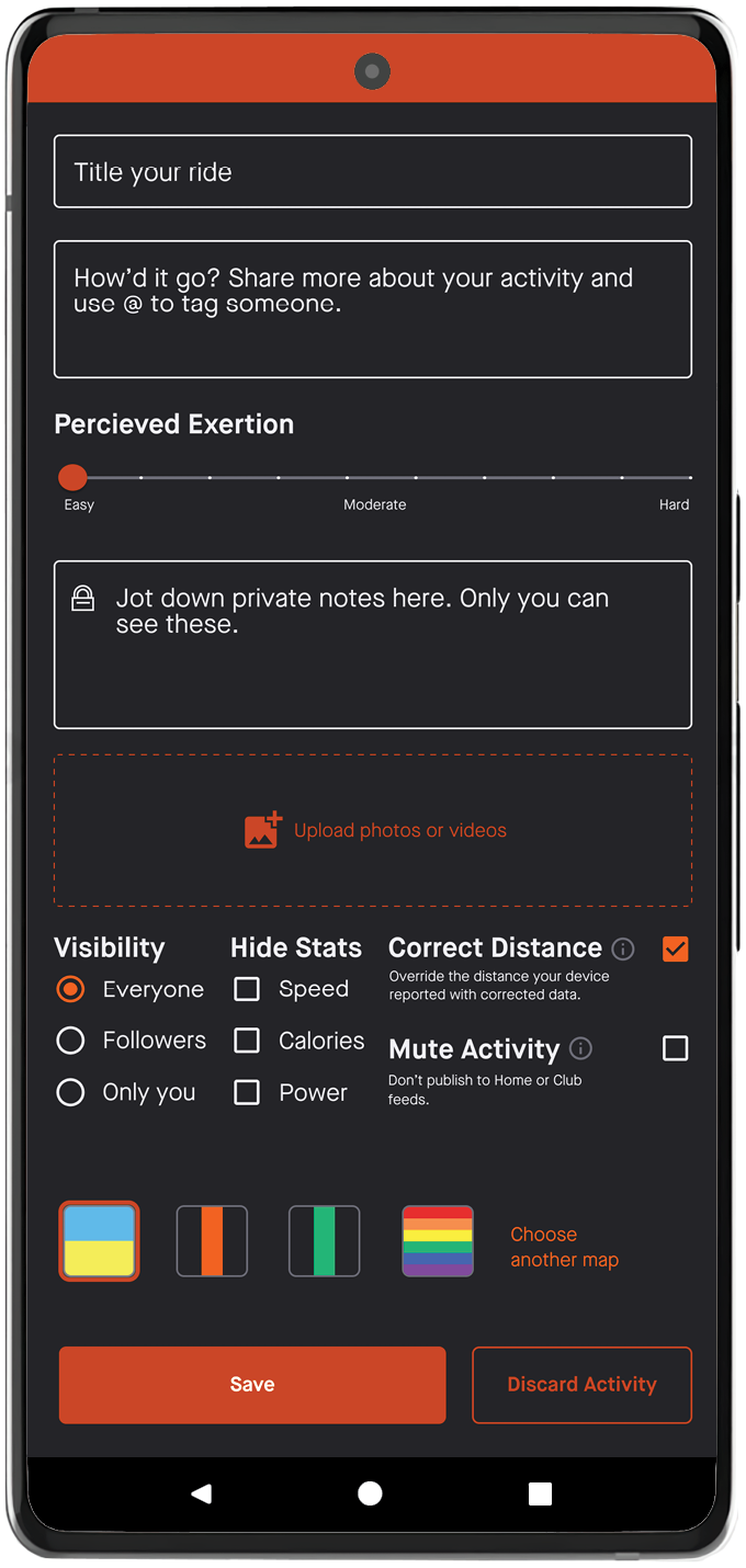
THE PROCESS
Experience Map
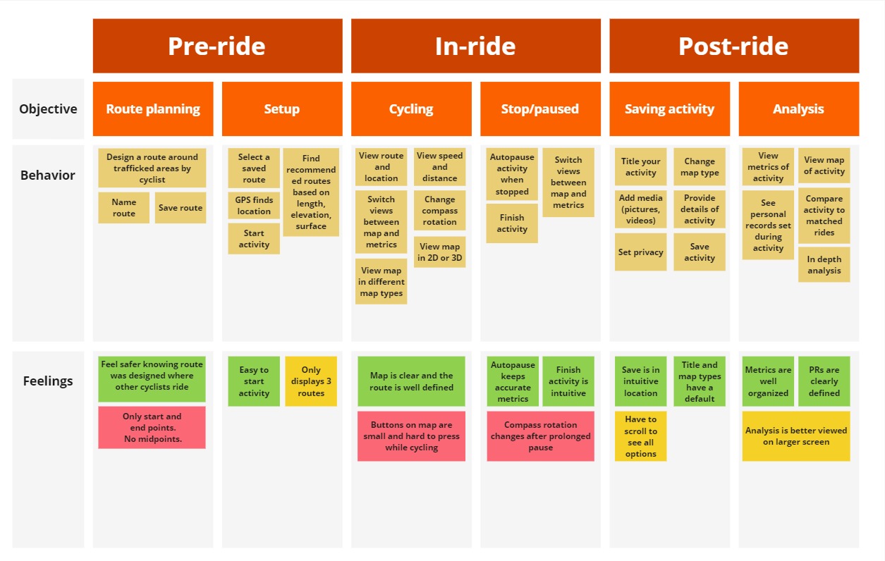
To simulate a real-world, design thinking activity, I created an experience map in Miro. This map is similar to an affinity diagram, but highlights the order of actions and pain points experienced along the way.
First, I added steps for each objective that are common during a cycling ride with Strava. Then, I added feelings that was gathered from user interviews for those objectives. The feelings are grouped into themes. Green boxes represents positive experience, yellow boxes represents a neutral experience, and red boxes represents a negative experience.
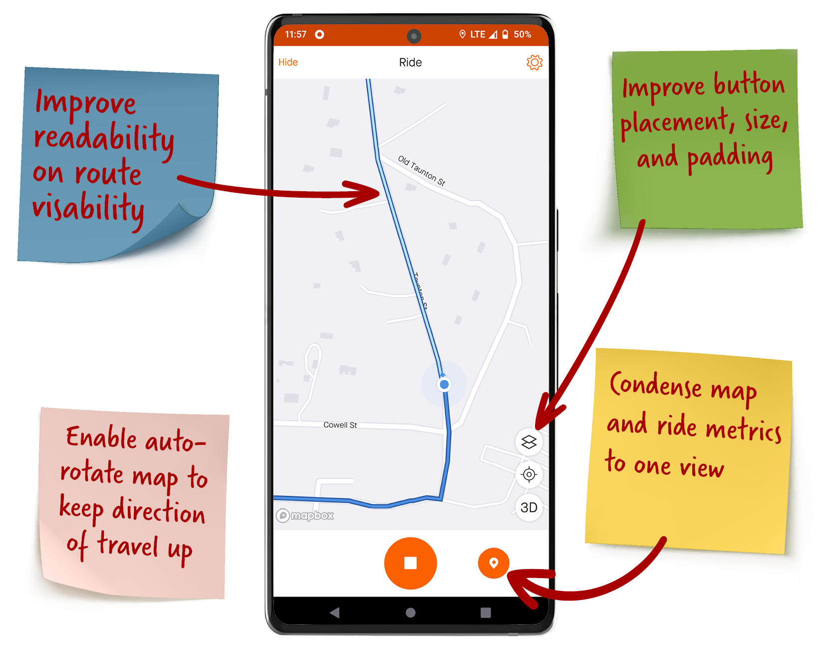
- Improve readability on route visibility
- Enable auto-rotate map to keep direction of travel up
- Condense map and ride metrics to one view
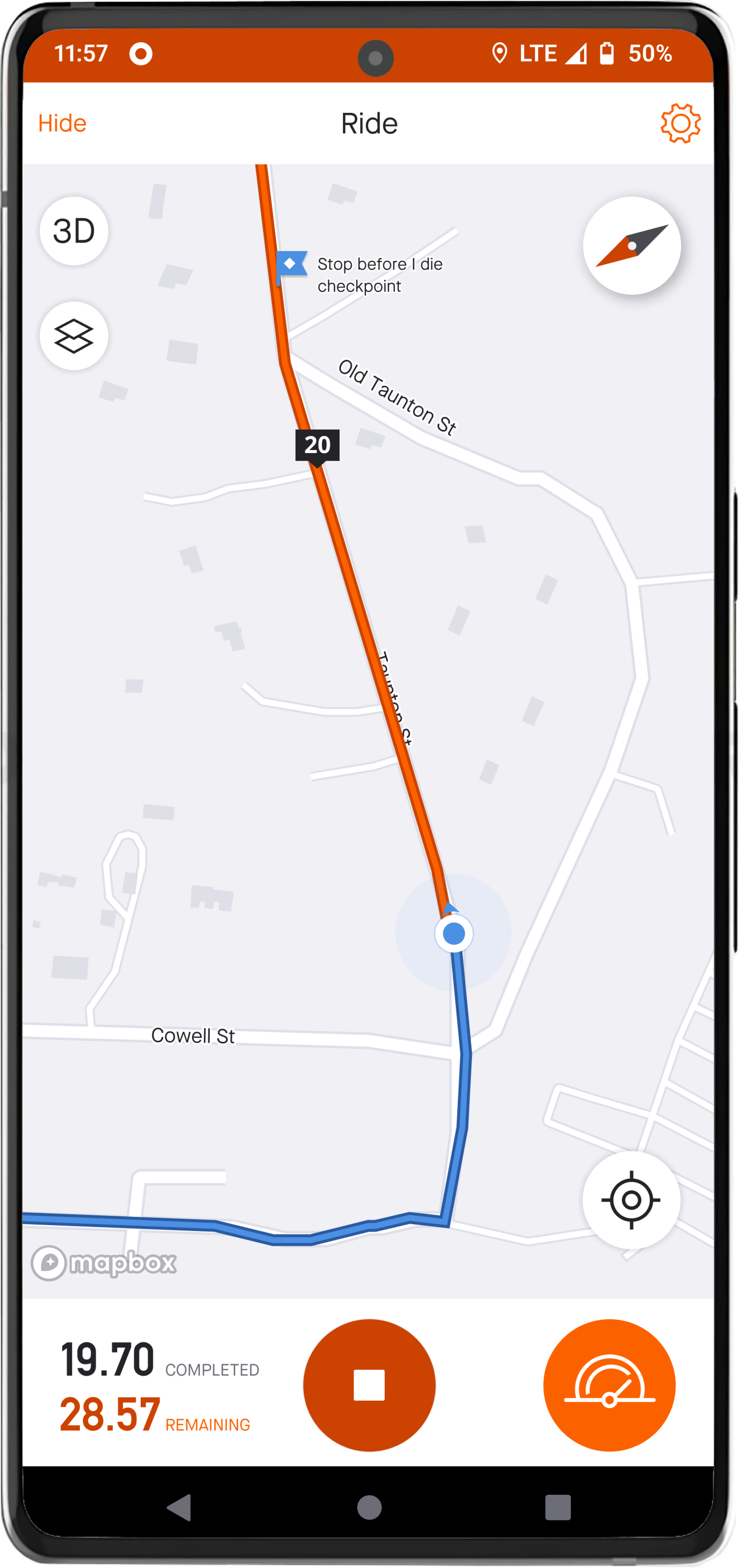
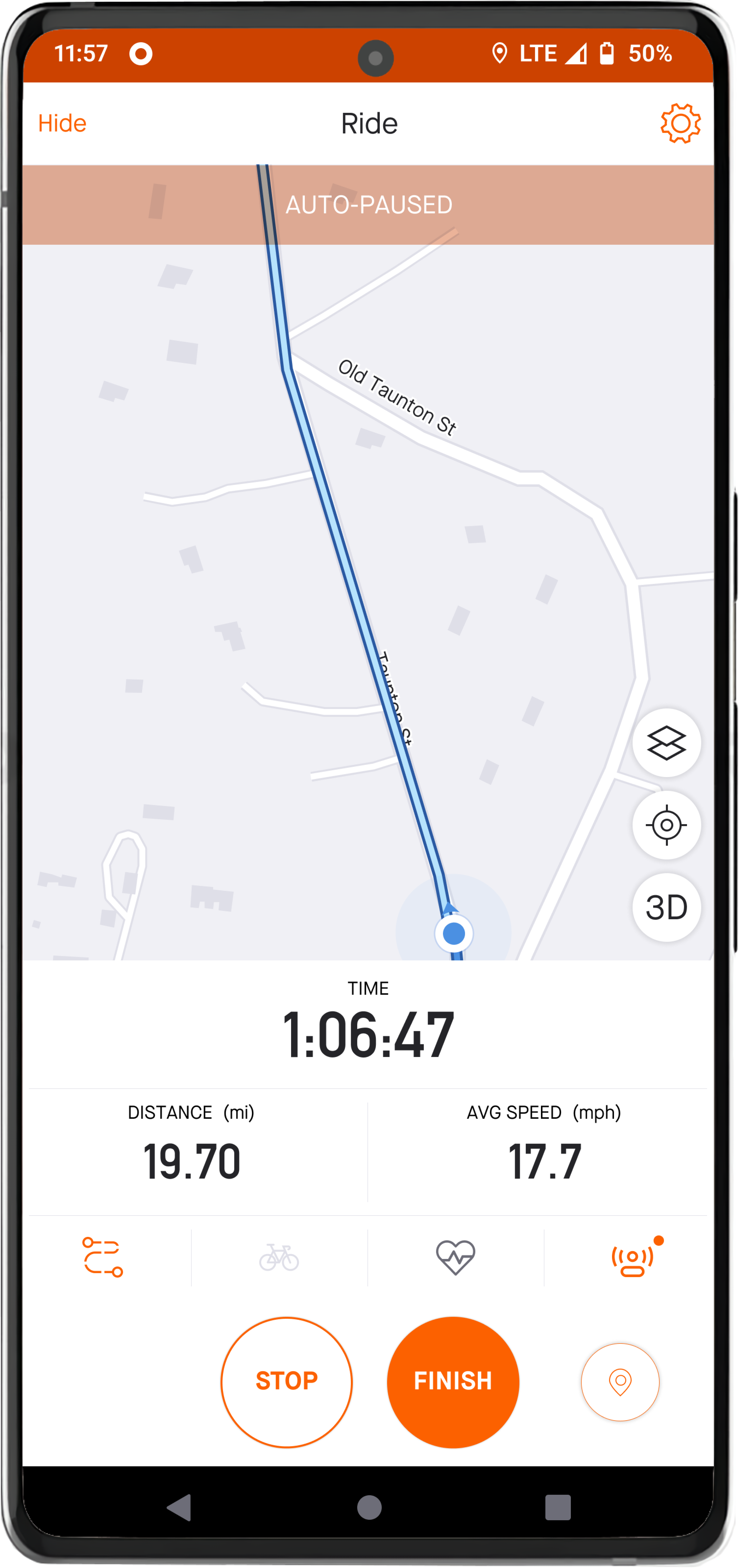
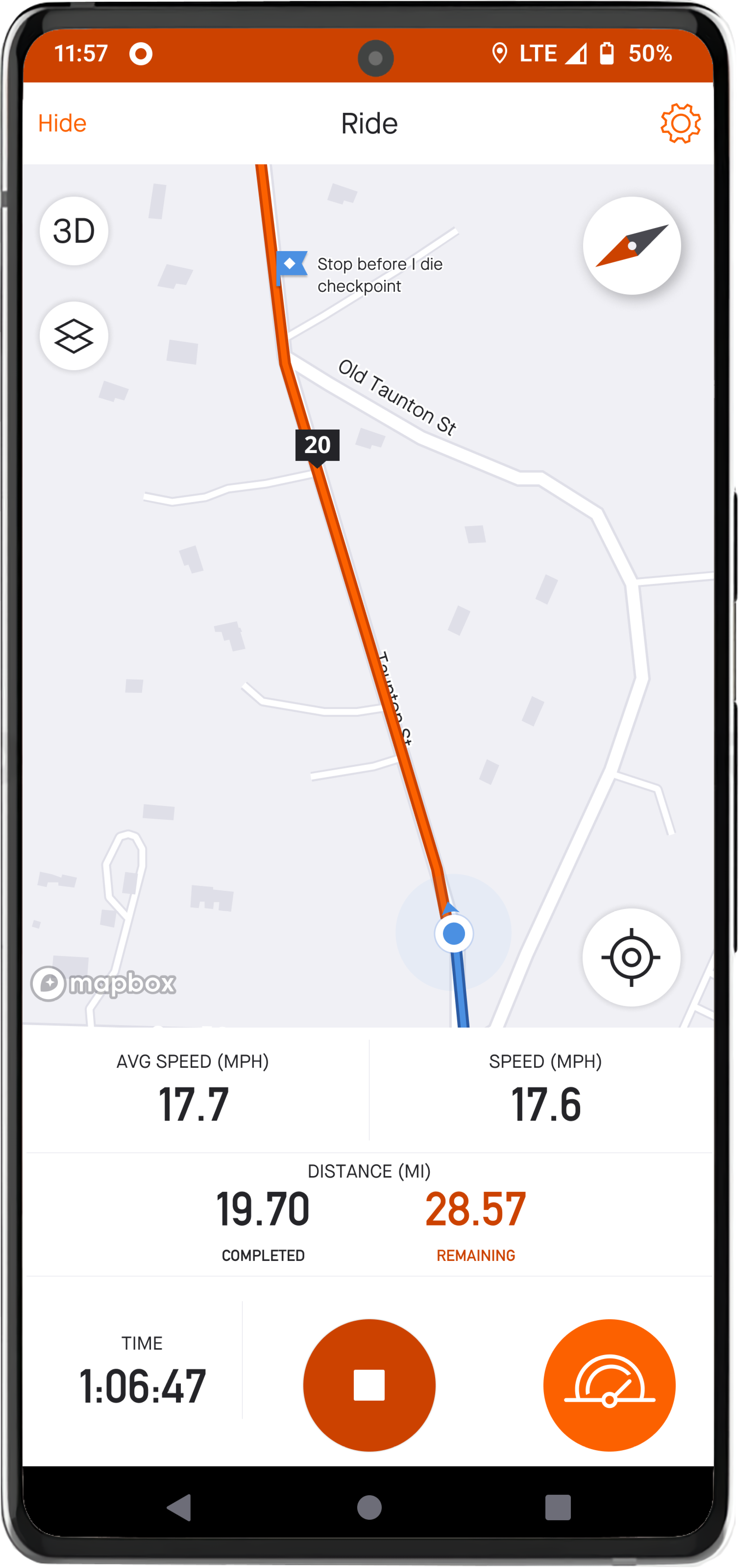
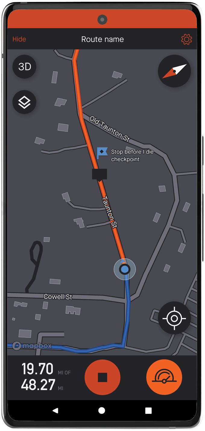
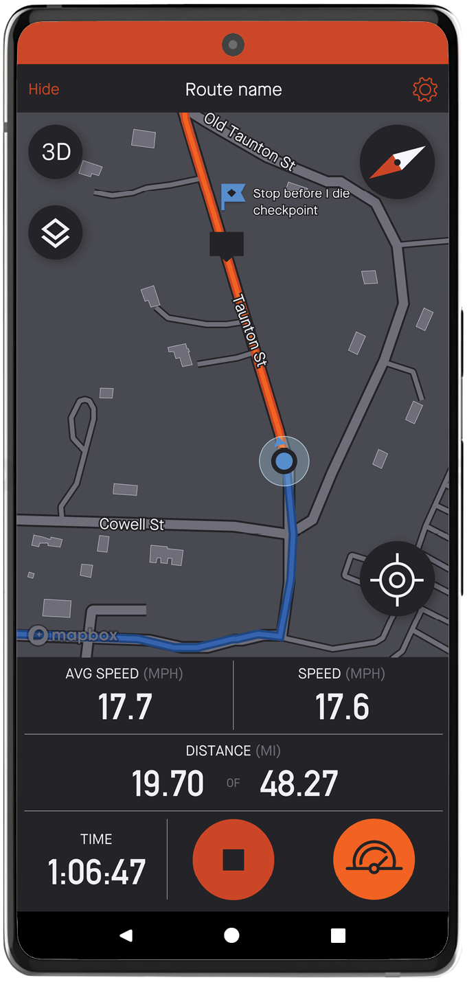
Pain point: Route visibility
Strava uses two shades of blue to visualize the route and the cyclist's progress. A more contrasting color palette is needed to improve readability on route visibility and cyclist's safety.
Pain point: Buttons
The cluster of icons on the map are small and too close together, especially during a ride. To accommodate different use cases, the buttons need to be bigger with more padding and placed in more accessible areas.
Pain point: Auto-rotate
In map view, the map does not rotate in the cyclist's direction of travel. Enable
auto-rotate to prevent
cyclists from manually rotating the map to keep their direction of travel up while
cycling.
Read the
update
Update:
Strava solved this in summer of 2022. However, when the ride is auto-paused, the compass will default back to "north up". The cyclist has to tap the compass icon to change back to "auto-rotate".Pain point: Ride metrics
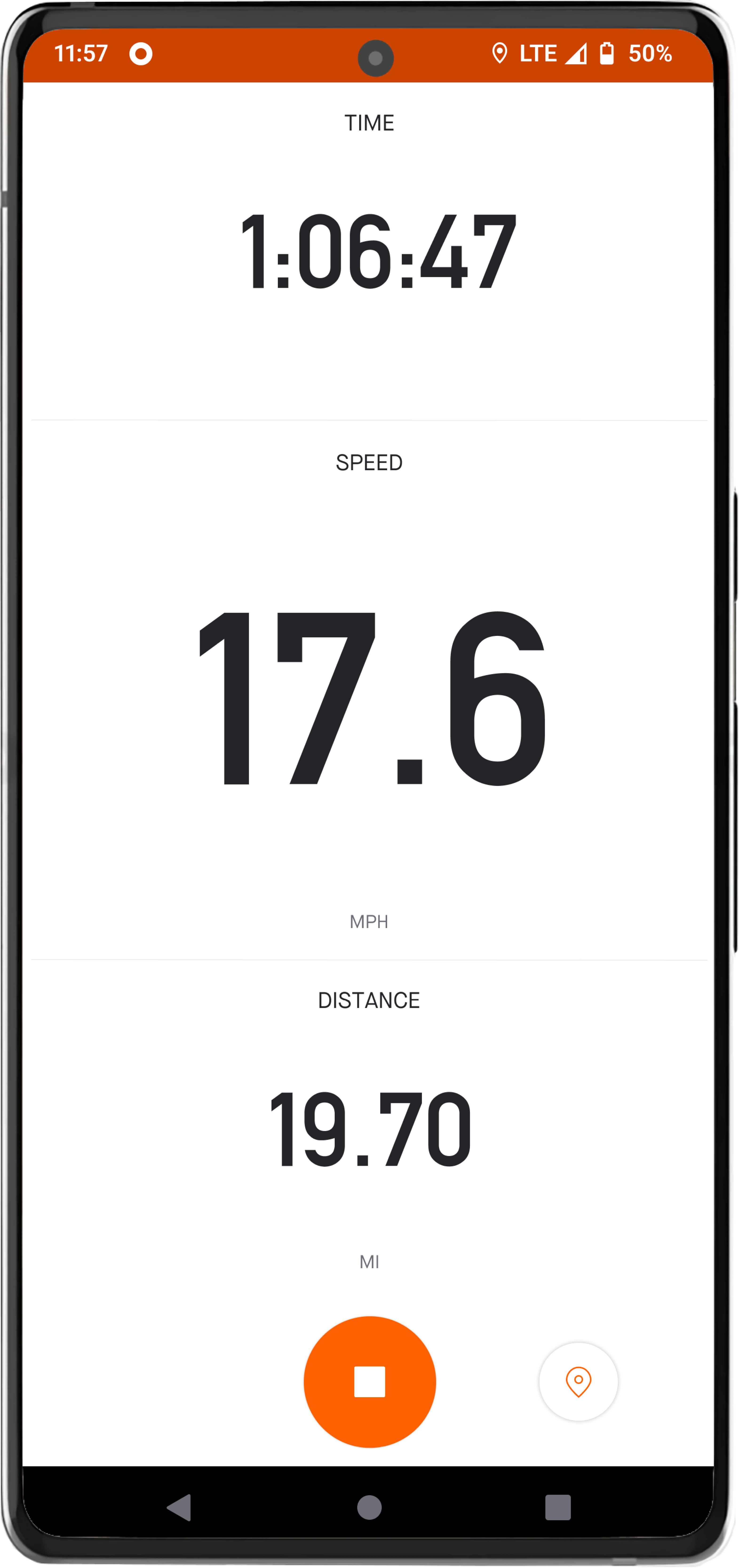
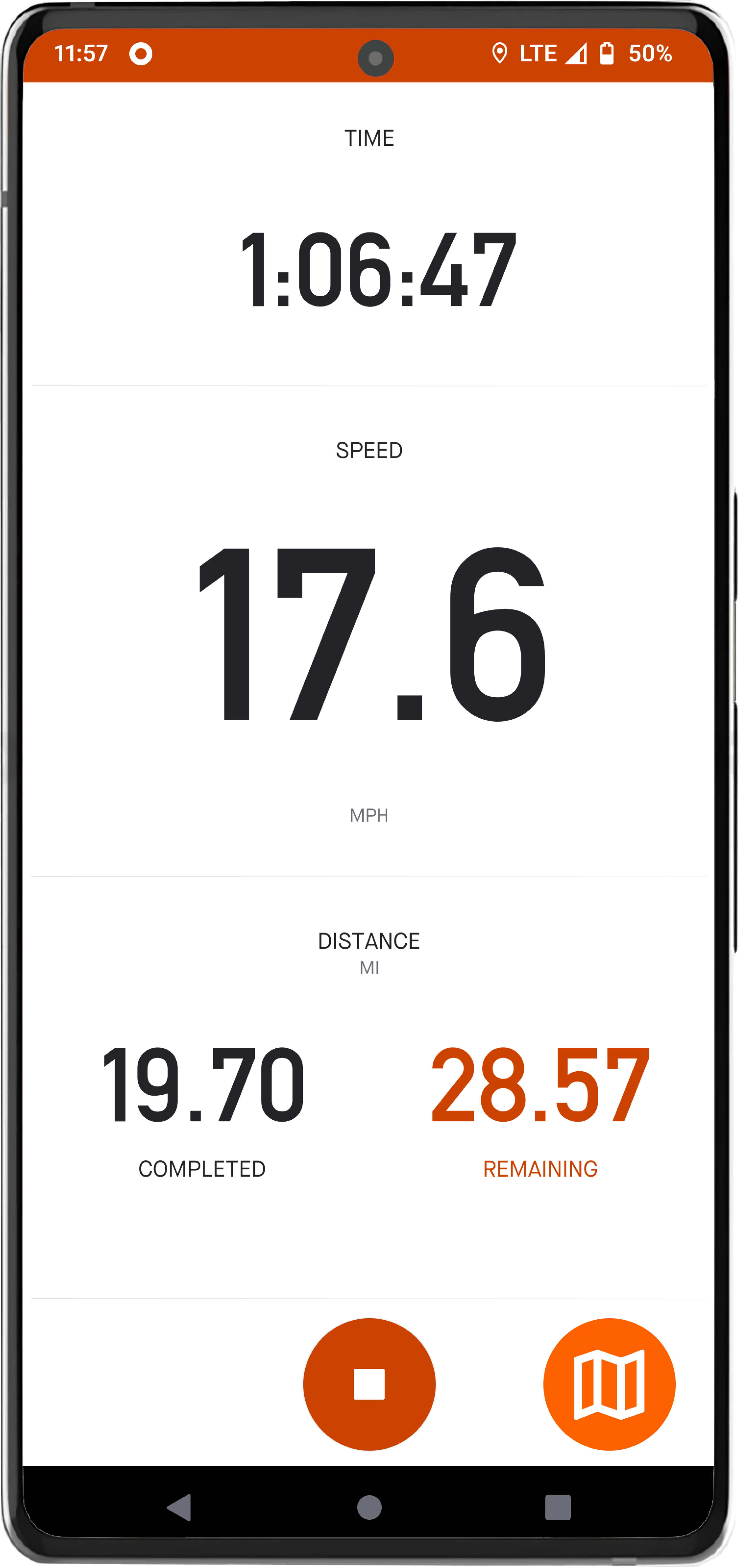
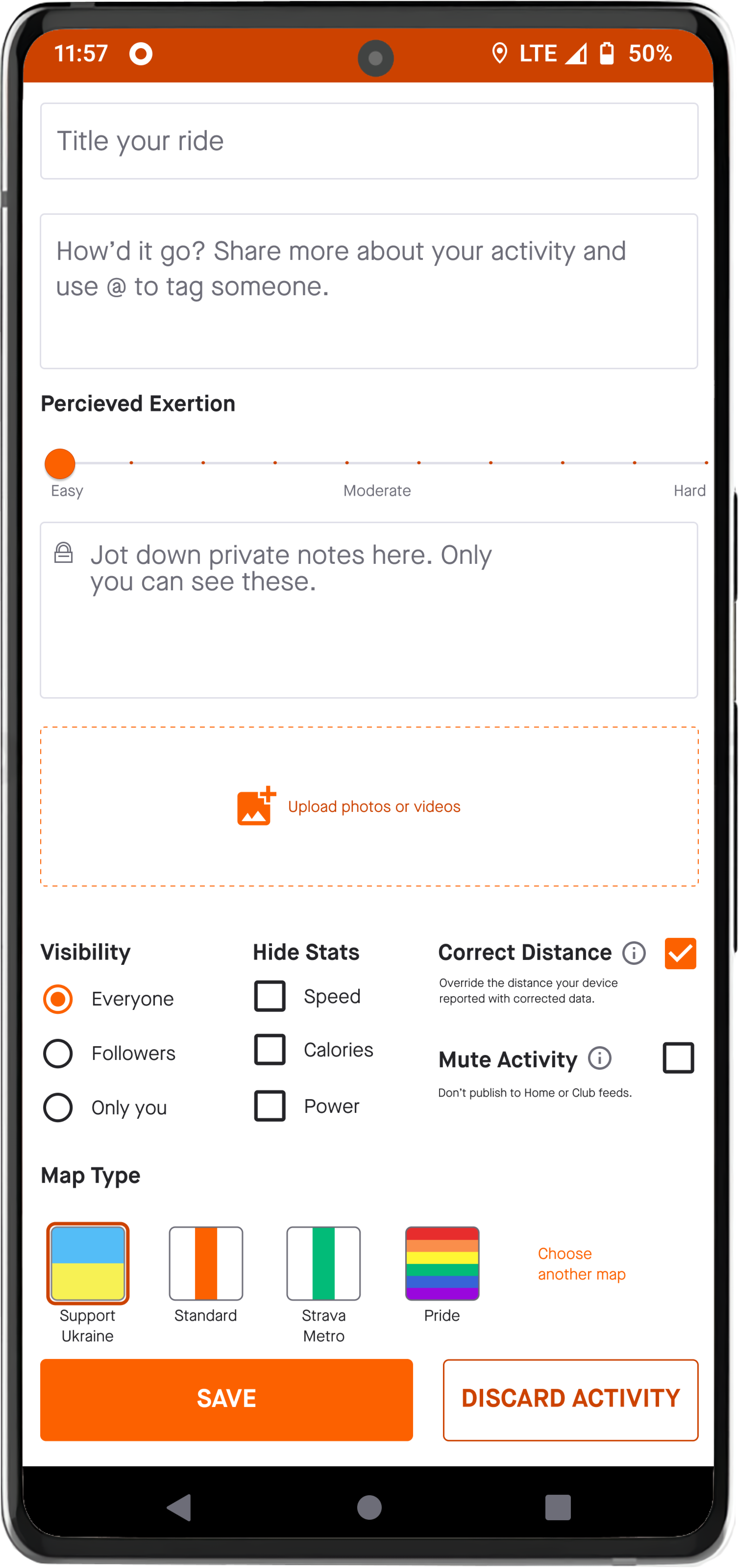
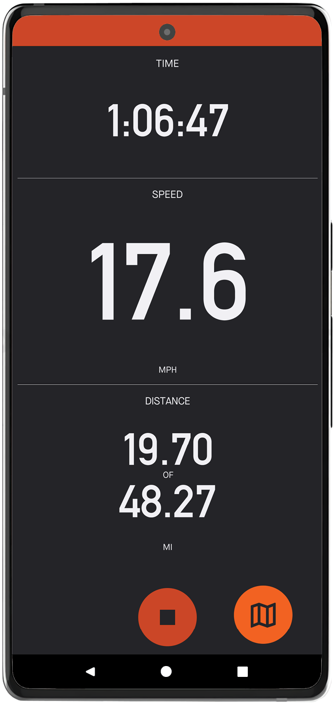
To see speed, distance traveled, or time elapsed, a cyclist must tap the small icon in the bottom right. Give the cyclist an option to view metrics and map on one view.
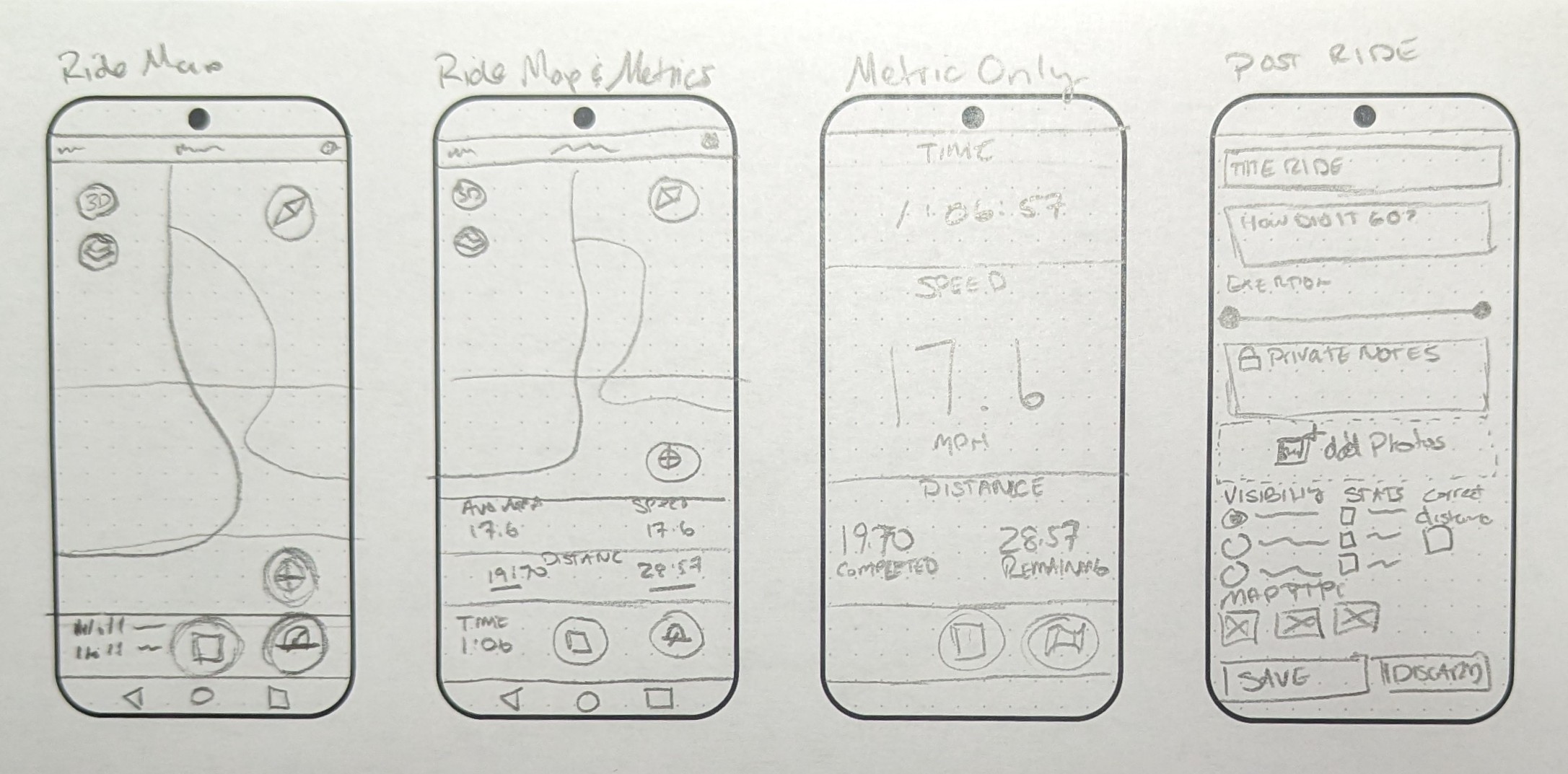
Wireframes